


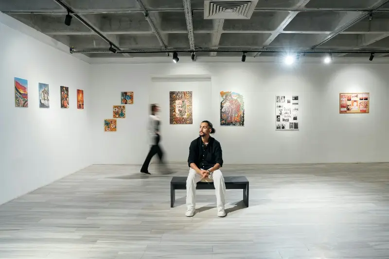
From feeling blue on a rainy day to picturing a fiery red when we are angry, color is deeply embedded in how we discuss and experience human emotions. This colorful language is not just poetic—it reflects an intricate, fascinating interplay between our senses, memories, and core psychological processes.
Why exactly do specific colors become symbols for certain moods? The answer lies at the crossroads of biology, psychology, and culture, revealing a hidden language that shapes our daily lives.
THE BIOLOGICAL ROOTS OF COLOR PERCEPTION
Color is far more than a simple visual experience; it is a profound psychological trigger. When light enters our eyes, it is detected by specialized cells called cones, which allow us to perceive a vibrant spectrum of hues. However, what happens in our brain is just as important as what happens in our eyes. Our minds are hardwired to interpret colors in emotionally meaningful ways.
Neurological research shows that color directly influences our physiological states:
- Warm Colors (Red, Orange): These hues can actively increase heart rate and stimulate the parts of the brain linked to excitement, energy, and alertness. This traces back to evolutionary traits, where red signaled vital targets like ripe fruit or immediate awareness.
- Cool Colors (Blue, Green): These shades trigger a contrasting, soothing effect in our bodies, consistently associated with calmness, stability, and deep relaxation.
These physical responses happen on an entirely subconscious level, quietly shaping how we feel within different environments.
PSYCHOLOGICAL CONNECTIONS: THE EMOTIONAL PALETTE
The link between color and emotion goes far beyond biology. Psychologists have long studied how colors affect mood in subtle but incredibly powerful ways.
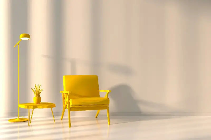
While certain reactions are widespread—such as yellow evoking sunshine, optimism, and raw positivity—our emotional palettes are also deeply personal. Past experiences, individual preferences, and distinct memories all dictate how we react to the world around us.
- Someone who grew up happily by the sea may find ocean blue exceptionally comforting.
- Conversely, someone who had a frightening childhood encounter in a dimly lit, dark green forest might feel uneasy around that exact shade.
These unique personal associations add a rich, beautiful layer of meaning to our lives, turning every individual's emotional palette into a customized masterpiece.

CULTURAL INFLUENCE: COLORS ACROSS BORDERS
Culture heavily dictates how we interpret colors on an emotional scale. Around the globe, the exact same hue can carry entirely opposite meanings.
- White: In Western cultures, white is widely celebrated as the ultimate symbol of purity, peace, and serenity. However, in many Eastern traditions, white is historically linked to mourning, remembrance, and quiet reflection.
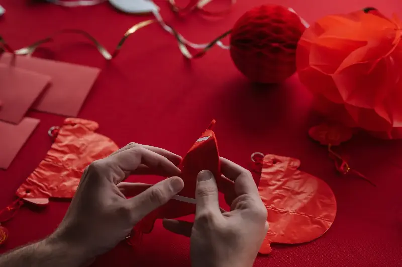
- Red: While it can indicate warning or intense urgency in some societies, red is recognized as a powerful symbol of luck, prosperity, and massive celebration in others.
These cultural narratives shape not only how we communicate about our feelings, but also how we actively express them.
COLORS IN LANGUAGE: SPEAKING WITH SHADES
Colors slip incredibly naturally into our everyday conversations. We casually say we are "green with envy" or eagerly looking for a "golden opportunity." This colorful vocabulary adds beautiful nuance and spice to human expression, letting us paint a vivid picture of our inner experiences.
Interestingly, studies show that people who frequently use color-based words to describe feelings are often highly attuned to subtle shifts in mood and excel at communicating complex emotions.
This language is highly practical:
- Marketers use precise color palettes to inspire consumer trust and excitement.
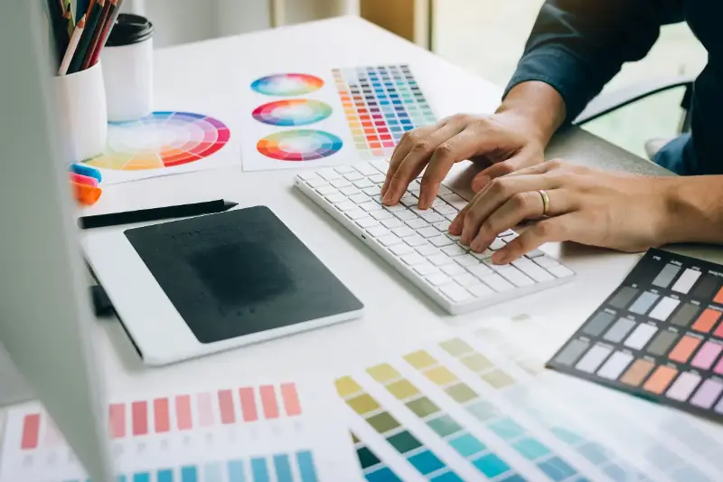
- Designers harness specific tones to create spaces that promote focus or joy.
- Children naturally use bright colors in drawings to showcase happiness before they can even fully articulate their feelings with words.
THERAPEUTIC POWER: COLOR IN HEALING AND WELL-BEING
The undeniable power of color has paved the way for innovative wellness practices. Modern designers, schools, and hospitals are increasingly recognizing the immense value of thoughtful color curation.
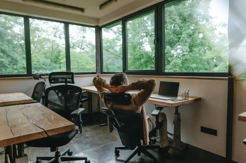
Designing a dedicated space with calming blues and gentle greens can dramatically ease daily anxiety and foster tranquility. On the flip side, introducing intentional splashes of bright yellow and uplifting orange can instantly revitalize spirits and boost productivity. Even in the digital world, app developers carefully select specific color schemes to ensure users feel comfortable, engaged, and balanced.
THE PERSONAL RAINBOW: EMBRACING OUR OWN HUE MOODS
Ultimately, the science of color reminds us of how beautifully our external environment shapes our internal world. Recognizing which specific colors lift your spirits or help you concentrate gives you a powerful tool to improve your day.
By honoring the connection between color and mood, we tap into a vibrant language that offers comfort, insight, and endless creativity. The next time a bright flower catches your eye or a clear sky changes your outlook, remember: there is real science behind the shades we feel.