


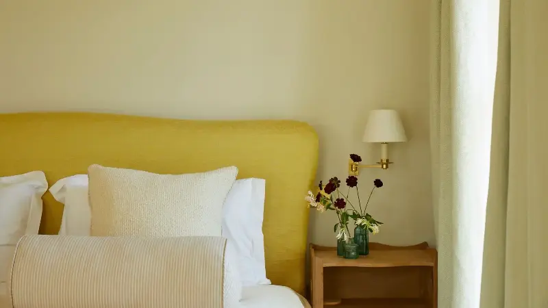
There are lots of reasons to love butter yellow — a soft pastel that adds warmth and a sense of nostalgia to rooms — but where do designers stand on this popular color as we head into 2027?
Butter yellow's ability to work as a 'new neutral', replacing often stark bright whites and grays, is no doubt what gives this shade so much appeal. Alongside the general shift in interiors towards greater color confidence, butter yellow provides that perfect middle ground between neutral and color, without feeling like too much of a commitment.
We asked designers whether they think butter yellow has become a truly timeless color trend that's here to stay, or one that's soon to be replaced. And, as we near the end of the year, they share the emerging shades that can feel like a refreshed take on butter yellow, but with more depth, warmth, and earthiness.
Why Are Butter Yellow Interiors So Popular?
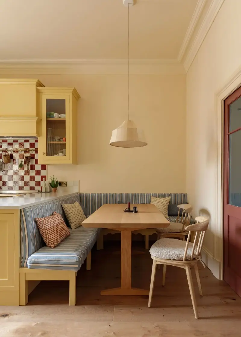
Although butter yellow has been a major trend in recent years, that's not to suggest it's an entirely new color. "Butter yellow appears throughout design history, seen in 18th- and 19th-century European and American interiors as well as in Spanish Mediterranean, Victorian, and Colonial Revival designs, and even again in mid-century spaces," explains designer Rachel Rector of Florida design studio Chinotto House.
But why has this soft hue made such a comeback lately? According to designers, it's all to do with its warmth. "After years of stark whites and cool grays, there has been a real desire for interiors to feel softer, warmer, and more welcoming, and butter yellow does this without feeling overwhelming," explains interior designer Ailsa MacConnell of Edinburgh-based Studio Mac.
And while the idea of decorating with yellow can seem bold, butter tones are easy to live with, working as an elevated neutral. "It has the softness of a cream but brings a little more color and personality to a room," says designer Laura Stephens. "It also works beautifully with the materials we’re increasingly drawn to — warm timbers, natural stone, aged brass, and patterned fabrics — so it can act as a really lovely backdrop rather than feeling like the main event."
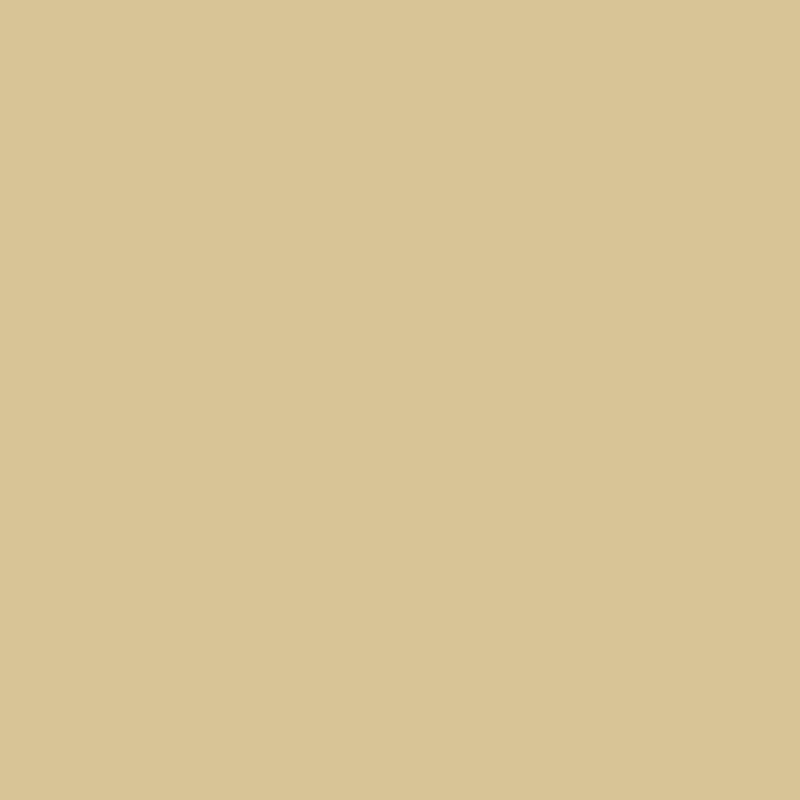
Rather than leaning too yellow or pastel, 'Hay' is a soft and earthy butter yellow paint that feels both timeless and livable when used on the walls.
Are Butter Yellow Interiors Timeless?
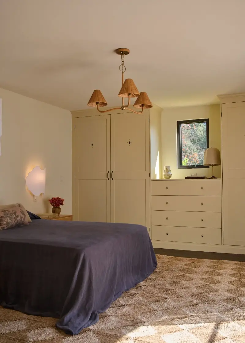
The timelessness of butter yellow decor is up for debate. While some view it as a classic, others see it as a more playful, 'trendy' trend. For Ailsa, this soft yellow hue falls firmly towards the former. "Butter yellow has been around for years and will be around for many more to come," says Ailsa. "While it may be having a particularly strong moment now, I don’t see it as a fleeting trend."
"What makes it so enduring is its versatility," she adds. "Unlike brighter and poppier yellows, butter yellow has a softness to it that allows it to sit beautifully alongside so many different tones. It brings warmth and character without shouting for attention."
But when it comes to decorating with neutrals, Laura questions butter yellow's longevity. "I wouldn’t necessarily treat the very specific butter yellow shade as a timeless neutral in the way I would a beautiful cream or stone," she explains. "Like any color that becomes hugely popular, it can start to feel overexposed if it’s used too literally or everywhere at once. The color itself has longevity; the way we choose to use it will evolve."
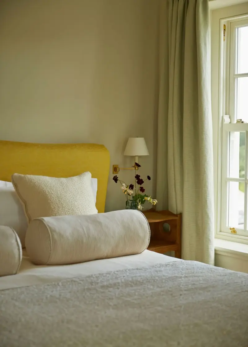
Some designers view the timelessness of butter yellow as a more personal choice. "The longevity of a color depends on the person, not the color itself, and I think this is a really important distinction," says interior color consultant Charlotte Cropper. "If you love this color and have always been drawn to it, then it’s going to feel timeless regardless. If butter yellow isn’t your thing, it will probably feel more like a fleeting trend and not worth investing in."
For designer Kelsey Coppetti of Los Angeles-based Studio Marrant, it's all about how it's embraced in a space. "If it's being executed in a space simply because it's on-trend rather than a color actually enjoyed, then it will almost certainly be phased out just as a new color trend emerges," she says.
Using butter yellow with a certain level of restraint, rather than too liberally, gives it more timelessness, suggests Kelsey: "I like to see butter yellow utilized as a softer neutral rather than a bold statement; what gives potential trends staying power is using them with restraint and not overdoing it."
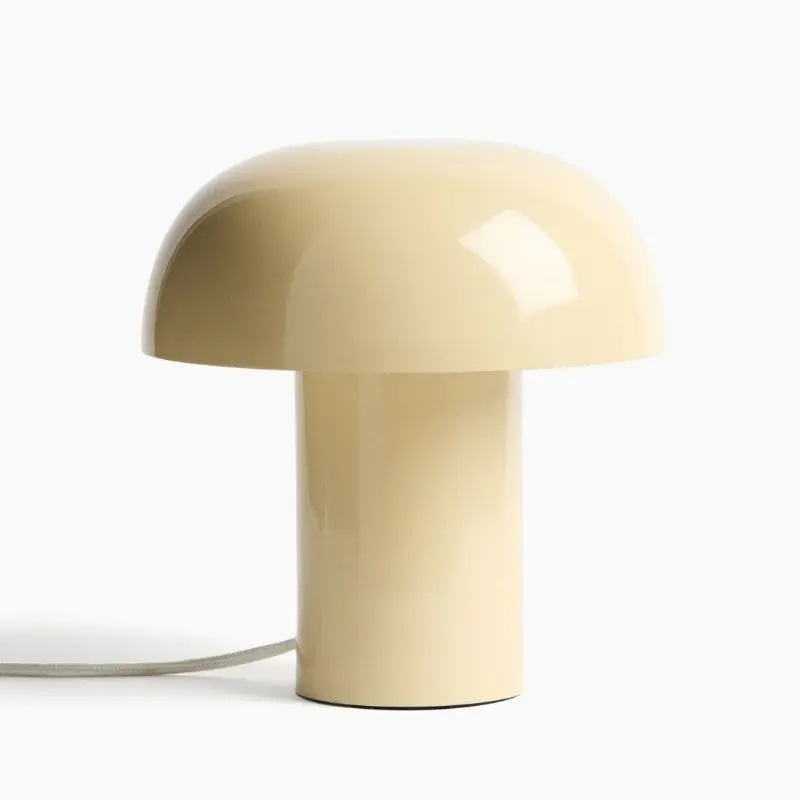
A small touch of butter yellow can feel more timeless than using it all over a room, especially when working with a neutral color palette.
What's Replacing Butter Yellow in the Trend Cycle?
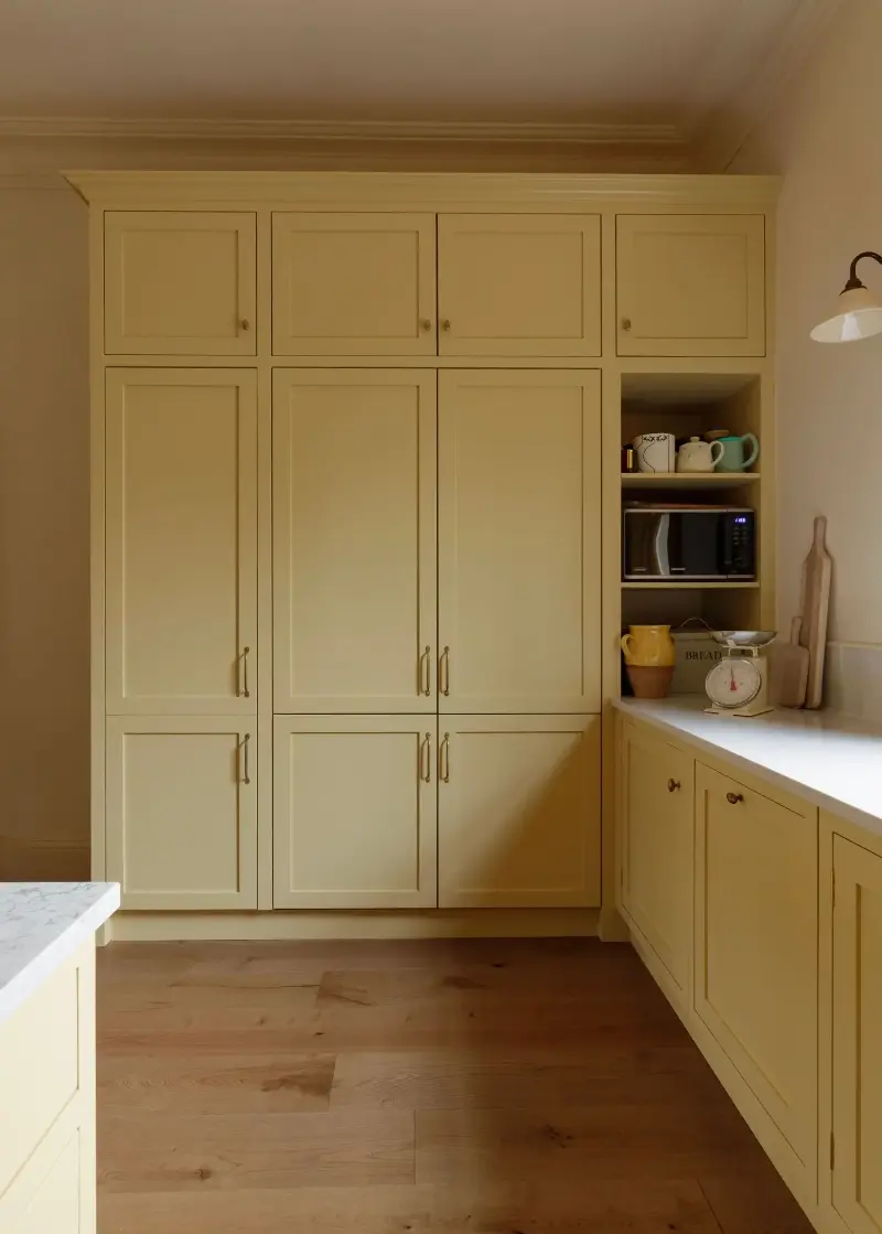
While butter yellow doesn't appear to be going anywhere quickly, it'll no doubt evolve in the ongoing color trend cycle. For some designers, the yellow trend is becoming much earthier and warmer. "I do think creamy, yellow-based neutrals are here to stay, whether that’s a traditional cream or a toned-down butter yellow," says Charlotte. "Alongside this, I am seeing an increasing demand for dirty ochre tones (think India Yellow by Farrow & Ball) and yellow-based bronze (like Light Bronze Green by Little Greene), moving away from yellow as we know it and towards more complex shades that feel cozy and comforting."
Laura also expects to see more of a shift toward much richer and earthier shades of yellow. "I think we’ll start to see yellows become a little more grounded and complex," she says. "I’m particularly drawn to soft ochres, straw yellows, muted mustard, and warmer, slightly muddier yellows that have a little more depth to them. They still bring that lovely sense of warmth and optimism, but feel less sweet and can sit beautifully alongside earthy greens, browns, reds, and natural materials."
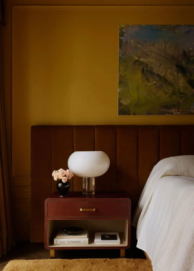
Paint trends are reflecting this shift, too. "We’re seeing interest move towards deeper, warmer shades such as golden yellows, ochres, and warm tans," says Helen Shaw, color expert at Benjamin Moore. "They offer the same warmth that has made yellow so popular, but feel a little more rich and timeless, particularly as we move into autumn. Rather than feeling tied to one particular trend, they can work as part of a wider, more enduring scheme, whether used across walls or introduced through cabinetry and accents alongside softer neutrals.”
Some designers are going one step further, favoring richer, darker neutral tones by decorating with brown. "Earthy, chocolatey browns are becoming a lovely alternative," says Ailsa. "They have that same warmth that people have been drawn to in butter yellow, but their slightly neutral quality makes them feel very easy to live with and appealing to a wider audience."
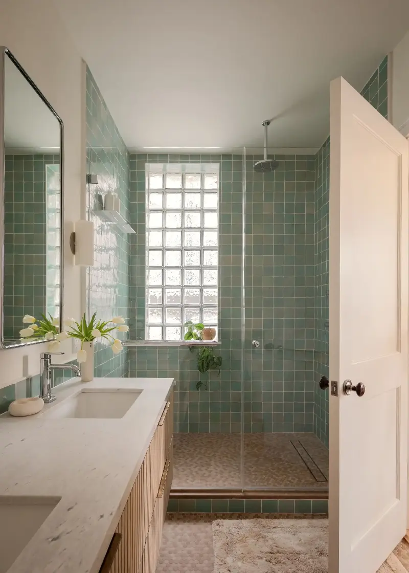
Outside of yellow and grounding neutrals, expect to see other pastel tones gain momentum. "We’re also seeing pastel and pistachio greens making their way back in," says Ailsa. "These softer greens have a freshness to them, but still feel gentle and livable. Similar to the yellows, they sit really beautifully alongside other stronger colors."
"I also think we’ll continue to see softer, chalkier versions of other colors like muted pinks, dusty blues, and gentle greens being used similarly," adds Laura. "Rather than looking for the next ‘new neutral’, I think we’re becoming more confident about using color as part of a layered palette, choosing shades that have a little character and work naturally with the rest of the room."
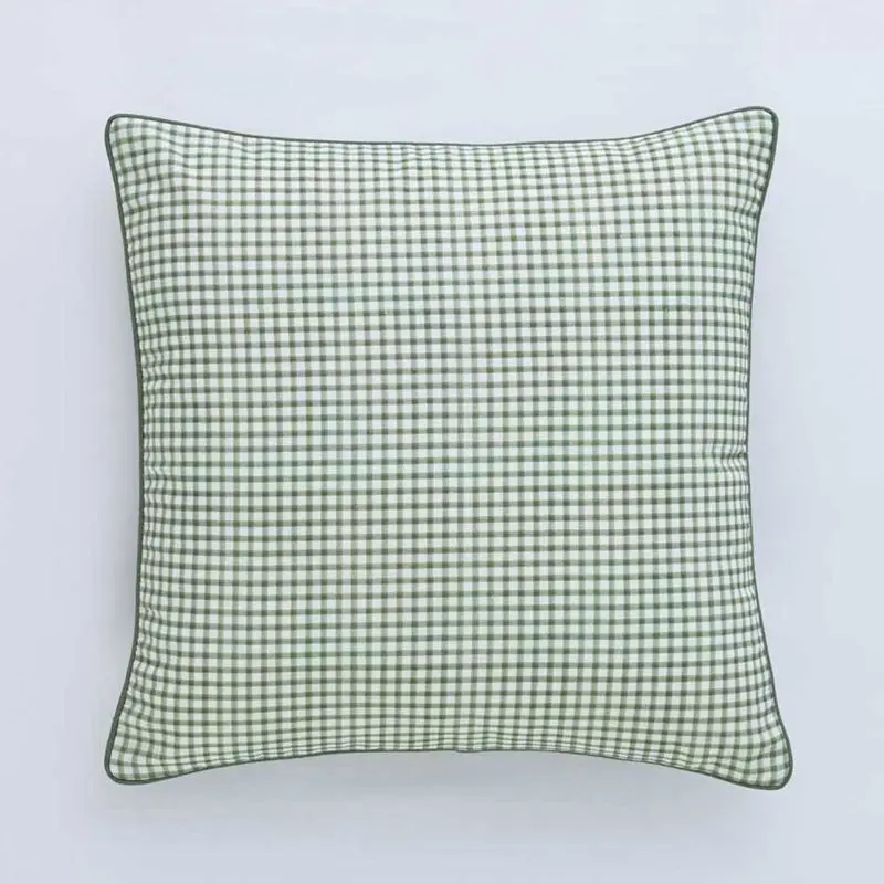
If you're looking for a playful alternative to butter yellow, go for pistachio green — a color designers expect to see more of in the coming months.
As with any interior design choice, you should first and foremost be guided by what you're most drawn to. That said, if you're looking for more expert advice for a design-forward home, take a look at the dated wall color trends that you may want to skip, according to designers.