



Biscuit and coconut. Mushroom and cream. These aren’t food combinations (although they could be) but colour pairings many of us play it safe with when decorating. Granted, they provide an easy backdrop for everyday life, but industry insiders would argue that life is too short to create a sitting room composed of 50 shades of greige.
“To me, colour combinations are magic spells for creating atmosphere,” says Nicola Harding, a designer who mixes baby-blue walls with red soft furnishings to dazzling effect. “The ingredients of the spell are determined by how much energy you want to create: the calmer you want the energy to be, the lower the degree of contrast; the more dynamic, the more unexpected and more clashing the colour combination should be.”
Rachel Chudley is a fellow designer who adores unexpected colour pairings and just launched her debut paint collection. The range features 14 dynamic shades with names such as Complicated Purple and Delicate Blue. “Colour can completely transform a home, and on a practical level it’s a very affordable way of transforming a space. Complementary colours that sit opposite each other on the colour wheel work really well together,” says Chudley.
For those tempted by a zesty yellow or a lush green and struggling to decide, the good news is that you can choose both, as the trend for embracing unusual colour pairings means anything is possible. Here, Chudley, Harding and other interior designers share the colour pairings they love and their tips for being braver.
Baby pink and mustard yellow
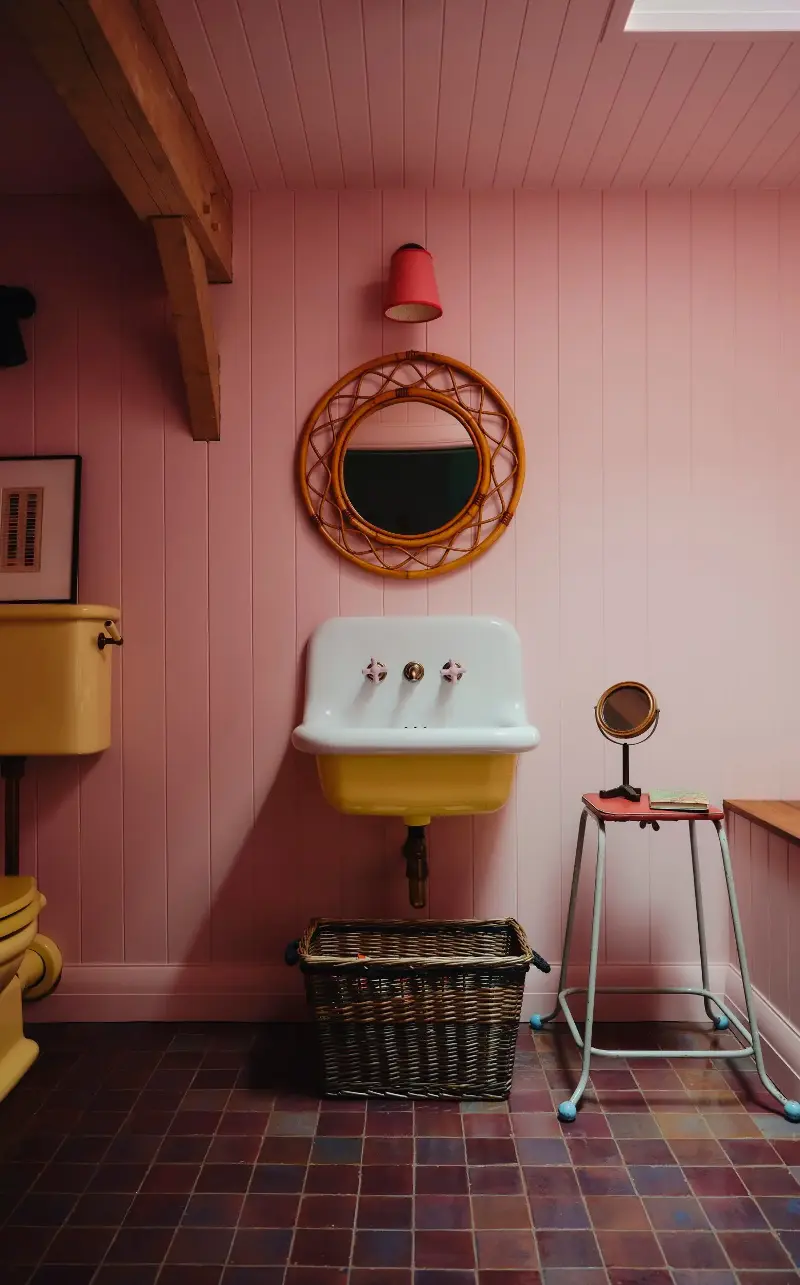
“A room that is used for a short amount of time can pack more punch than one that is needed a lot,” reasons Harding (this way of thinking also explains the bold personality of many a downstairs WC; as nothing more than a transitionary space, it’s a spot where you can let your imagination run a little wilder). Pairing sugary-pink walls with yellow sanitaryware in an occasional bathroom off a bedroom geared to children, Harding concedes: “It’s playful and works because it’s fun for a bit – but probably too much for every day!” Accents of brown, from the bathtub’s edge to the floor tiles, are what help ground the room. “And the red lampshade is the cherry on top,” adds Harding.
Light blue and dusky pink
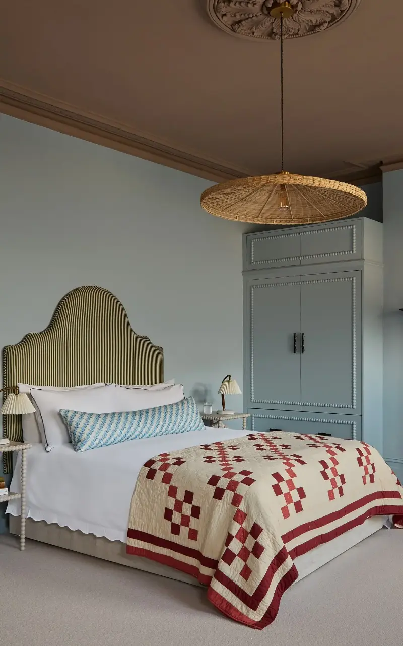
A ceiling is a great surface on which to have fun with a colour contrast: “It’s one of the largest uninterrupted surfaces in a room and can completely transform the atmosphere. In bedrooms especially it’s a wonderful opportunity to create a more restful and cocooning feel without making the space feel dark,” says interior designer Laura Stephens. In the pictured London home she used a cool, soft blue (Farrow & Ball’s “Parma Gray”) with a warm pink-brown (”Dead Salmon”, also by Farrow & Ball) to make the room’s lofty proportions feel more enveloping. “It’s a combination that feels very natural – reminiscent of a soft blue sky meeting the warmth of the earth at dusk – so there’s an inherent harmony between the two colours,” explains Stephens. Her tip is to choose colours with a similar muted intensity rather than opting for strong contrasts, “so they complement rather than compete with one another, creating a scheme that feels calm, layered and timeless”.
Khaki and bright yellow
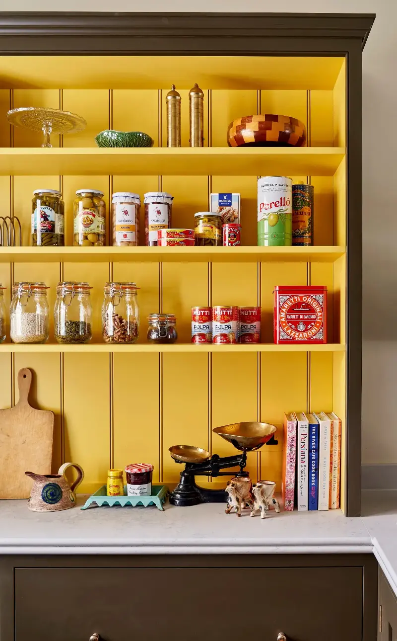
Primary colours don’t make it into living areas often enough – unless Lonika Chande is involved. The interior designer is known for effortlessly adding pops of red and bright blue to kitchens. In this space, an open cabinet on a kitchen worktop trimmed in a deep green-brown known as “Bronze” (by Paint & Papers) contains a flash of unapologetically cheery yellow (“Babouche” from Farrow & Ball). The combination works, says Chande, because each colour has a distinct role: “The earthy green brings depth and a sense of calm, while the yellow introduces warmth, optimism and a little playfulness. The green prevents the yellow from becoming overly sweet and overwhelming the space. Together they are joyful and easy to live with.”
Blue and orange
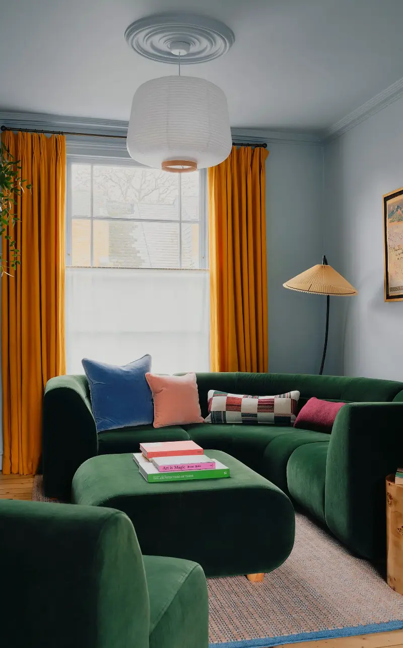
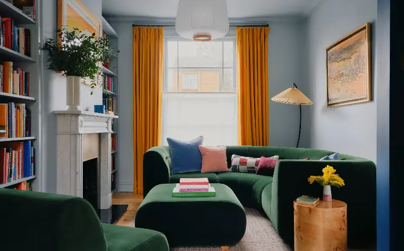
Think of a crisp or spring morning and a clear blue sky with a bright burst of sunshine comes to mind. That’s exactly what the designer Lizzie Green replicated in this sitting room to offset the north-facing orientation. “It’s very uplifting,” she says of what appears to be a punchy – but is in fact a very natural – pairing of pale-blue walls with egg-yolk-coloured velvet curtains. The dark-green sofa and armchair add to the outdoors-inspired palette.
Red and green
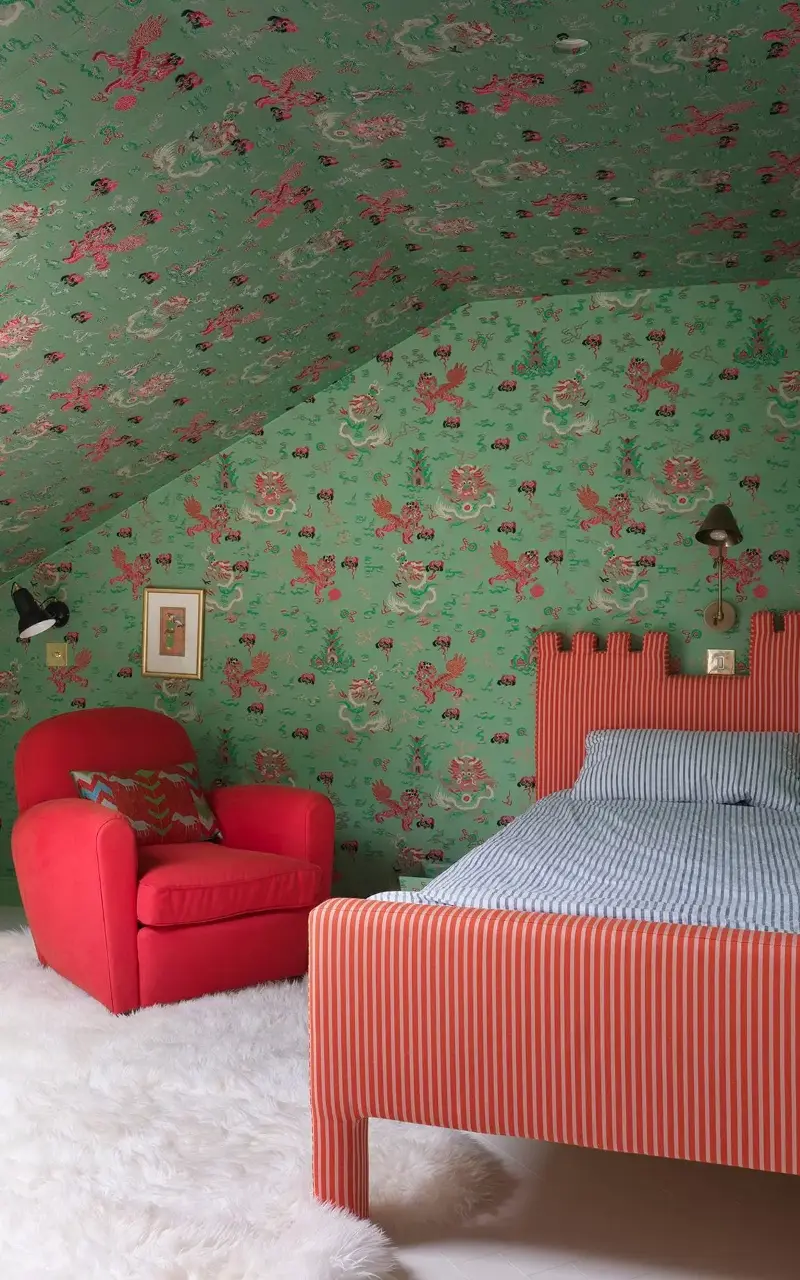
“People are often nervous about pairing red and green because they worry it will look too Christmassy,” says Chudley, who likes to pair colours from the opposite ends of the colour wheel to create drama. The reason this bedroom from a townhouse in east London doesn’t look as if it’s perennially stuck in December is that Chudley has chosen a bright red and an acidic green. “It’s a combination you rarely see, and that’s exactly why it stops you in your tracks,” she explains. The walls are in fact wrapped in fabric, and the red cabinet is painted with a high gloss. “Layering materiality like this changes how you perceive the colours – the softness of the fabric is what makes the whole thing feel liveable rather than overwhelming,” adds Chudley.
Pink and peach
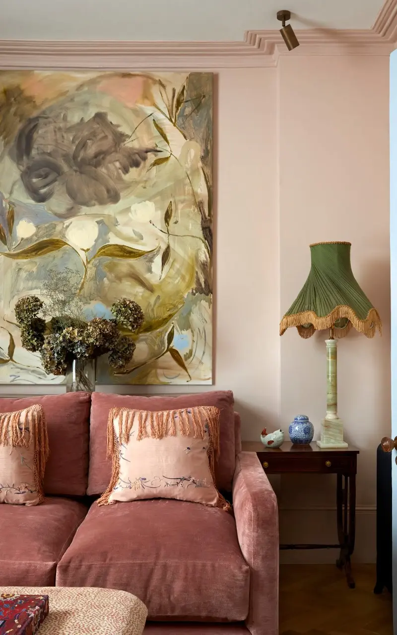
Experimenting with colour doesn’t have to mean only using opposites. “The key to creating a gentle softness and an antique feeling is using similar tones from one colour palette,” says Chudley, who used Light Pink from her collection in this London townhouse. “There’s a common perception that pink and red clash because they’re close, but I’ve never understood why. They’re part of the same colour family, so they actually work perfectly together. Adding browns, dusky greens and neutrals brings a lived-in warmth to the space, ensuring it never feels too pink or overly feminine. Instead, it evokes the timeless character of a beautiful old home.”
Blue and green
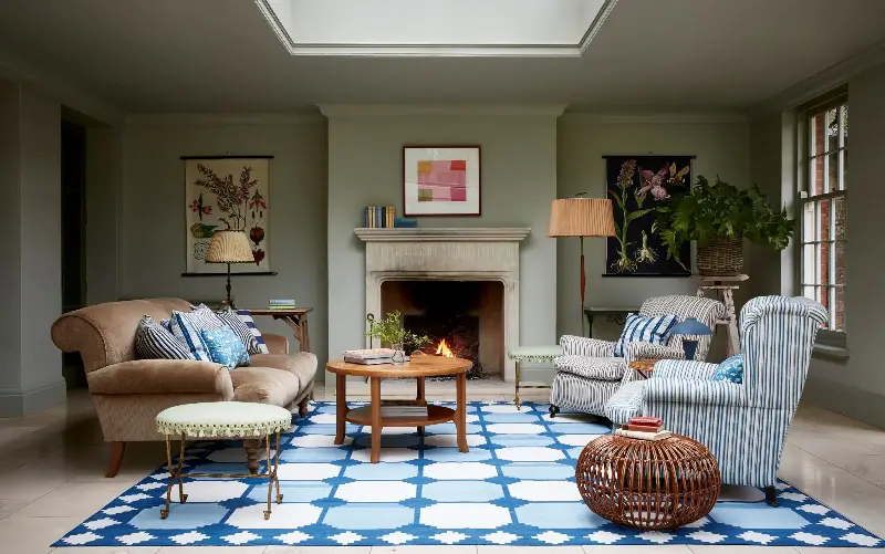
“Some say that blue and green should never be seen, but I rather like them with each other,” says Harding, who argues that using both within the same room stops each colour from feeling too “safe”. “There is something slightly nostalgic about the slight clash, and it’s the imperfect unpredictability of it that makes it feel relaxed and interesting,” she adds. “For me there is rarely a wrong combination,” Harding assures, “it is more that a colour combo is being put to use in the wrong way.”